

Instagram is one of those apps that everyone either loves or hates, especially since they took away chronological order and decided to play with the algorithm to make it much harder for creators to get their content noticed on there yet there is still a part of me that loves it. I love how everyone has the ability to share snippets of their lives and build up a story of their lives throughout the images they they post.
One of the main things everyone will notice is that everyone, especially bloggers, seems to have a theme for their instagram which makes everything seem a lot more coherent and put together. I thought I would share a few of the ways I edit my photos for my current 'theme' to help you guys out!

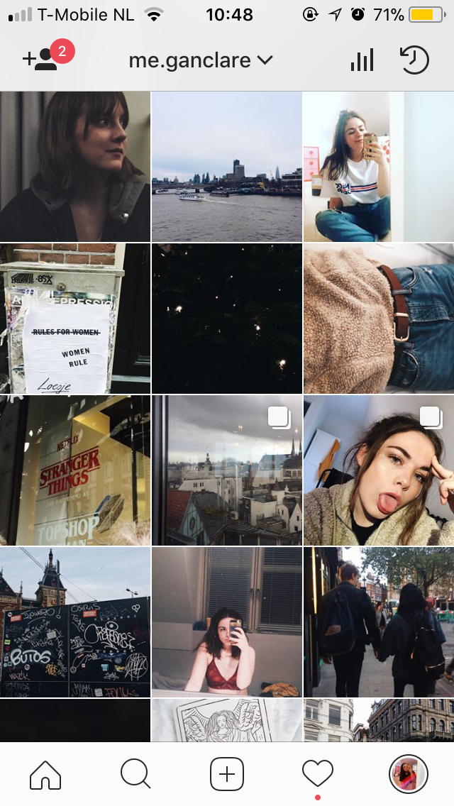
As you can see in the picture above my theme is mainly based on neutral colours and reds which is something that my general aesthetic works well with meaning I am able to regularly post. When it comes to editing and placement I use VSCO as I am then able to see the way that the images are going to end up looking together before actually uploading them onto my Instagram feed.

Once I put my photo into VCSO the first thing I do is apply a filter, I tend to go for A9, A8, A7 or A6 as it gives a sense of fluidity to the images if you stick to the same kind of filter. I am pretty sure that you may have to pay for these filters but can't remember too well as I have had this app and all these filters for years now however all filter packs are super inexpensive and if you are anything like me then they will be sure to get the usage for their prices. Then I adjust the amount of the filter (basically playing round with how harsh it will be until I am happy) which is something that varies for every image, for this one I halved the amount of colouring from the filter and then moved onto the other editing tools that the app offers.

My final edits tend to look a little like this, I will always bring up the contrast and play around with the exposure to see whether it needs to be brought up or down (in this case it was down) and work on the saturation for a final extra pop of colour. The only other thing you can't see on here is the fact I also like to use the grain effect which is something that not everyone loves (I have one friend who detests grain on her images) but I think it adds a bit of texture to the shots and makes everything tie in a little more.


1 comment
Your insta feed is BEYOND aesthetic. I love all of your photos, and everything looks so beautifully cohesive!!
ReplyDelete